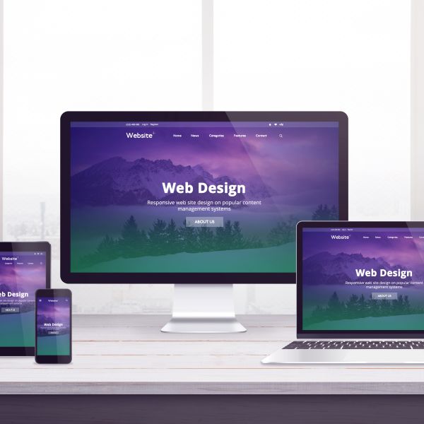
Responsive Web Design

Creating Layouts That Work on Every Screen

Responsive Web Design helps websites adapt to phones, tablets, laptops, and desktop screens. It uses flexible layouts, responsive images, media queries, CSS Grid, and Flexbox to create a smooth user experience.

What is Responsive Web Design?

Responsive Web Design is a design approach that allows one website to adjust to different screen sizes. Instead of creating separate versions for desktop and mobile, the same website layout responds based on the user’s device.

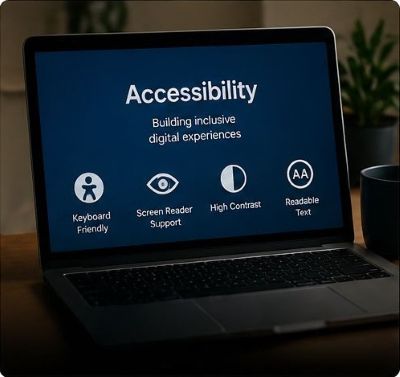
Why It Matters

Users browse websites on many devices. Responsive design improves readability, navigation, accessibility, and overall usability by making sure content remains clear and organized at every screen size.

Responsive Design Code Examples

These are common CSS techniques used to create responsive layouts.

01

Flexible Images

Images should resize inside their containers instead of overflowing.


img {
max-width: 100%;
height: auto;
display: block;
}
02

CSS Grid Layout

Grid can create flexible card layouts that adjust automatically.


.card-grid {
display: grid;
grid-template-columns: repeat(12, 1fr);
gap: 22px;
}

.card {
grid-column: span 4;
}
03

Flexbox Navigation

Flexbox helps align navigation items and wrap them when needed.


  .nav-links {
  display: flex;
  align-items: center;
  gap: 10px;
  flex-wrap: wrap;
}

Using Media Queries

Media queries allow CSS to change based on screen width. This helps layouts move from multi-column desktop designs to single-column mobile designs.


  @media (max-width: 768px) {
  .card-grid {
  grid-template-columns: 1fr;
  }

  .nav-links {
  flex-direction: column;
  }

  .hero {
  padding: 56px 22px;
  }
}

Mobile-First Design

Mobile-first design means styling the smallest screen first, then adding larger layouts with media queries.


  .card-grid {
  display: grid;
  grid-template-columns: 1fr;
}

@media (min-width: 768px) {
  .card-grid {
  grid-template-columns: repeat(3, 1fr);
  }
}

Responsive Units

Relative units help designs scale better than fixed pixel values.

.hero-title {
  font-size: clamp(2.3rem, 7vw, 5.5rem);
}

.site-wrapper {
  width: min(100% - 40px, 1200px);
}

Responsive Design Takeaway

  • Use flexible images with max-width: 100%;.
  • Use CSS Grid for page layouts and card sections.
  • Use Flexbox for navigation, buttons, and alignment.
  • Use media queries to adjust layouts for tablets and phones.
  • Use responsive units like rem, %, fr, and clamp().
  • Test layouts on desktop, tablet, and mobile screen sizes.

Responsive Web Design Resources


Explore Web Design Principles

Scroll and select a card to visit full resurce page to learn more.